Friday, 4 March 2016

Movie poster feedback. Questionnaire results and Analysis.

For the movie poster that I have made, I have decided to get feedback on them to see what people thought about them and if they represented the movie well. I asked the following questions 3 times, for each draft version of the poster. To accomplish this I asked 3 students aged between 16-17 for their opinions on these posters.


Have you seen Paul Blart Mall Cop 2?
-Yes
-I have seen clips of it
-I plan to watch it
-No, but I have heard of this film
-No, it doesn't appeal to me

What genre of movie do you think this film is?
-Sci fi
-Action
-Horror
-Drama
-Thriller
-Western
-Romance
-Comedy
-Musical

The film is rated PG, is the poster appropriate?
-Yes
-No

Do you like the poster?
-Yes
-No

Would you watch this film after seeing this poster?
-Yes
-No

Results

Have you seen Paul Blart Mall Cop 2?
-Yes                                                  I
-I have seen clips of it                      II
-I plan to watch it                             
-No, but I have heard of this film     
-No, it doesn't appeal to me              

Draft 1

What genre of movie do you think this film is?
-Sci fi
-Action       III
-Horror
-Drama
-Thriller
-Western
-Romance  
-Comedy     III
-Musical    

The film is rated PG, is the poster appropriate?
-Yes   III
-No

Do you like the poster?
-Yes   II
-No    I

Would you watch this film after seeing this poster?
-Yes   II
-No    I

Draft 2

What genre of movie do you think this film is?
-Sci fi
-Action       III
-Horror
-Drama
-Thriller
-Western
-Romance
-Comedy     III
-Musical

The film is rated PG, is the poster appropriate?
-Yes   III
-No

Do you like the poster?
-Yes   III
-No

Would you watch this film after seeing this poster?
-Yes   III
-No

Draft 3

What genre of movie do you think this film is?
-Sci fi
-Action       III
-Horror
-Drama
-Thriller
-Western
-Romance
-Comedy     III
-Musical

The film is rated PG, is the poster appropriate?
-Yes    III
-No

Do you like the poster?
-Yes    III
-No

Would you watch this film after seeing this poster?
-Yes    II
-No     I

Thursday, 25 February 2016

Paul Blart Mall Cop 2 poster 3rd and final draft

This is my final version for my Paul Blart Mall Cop 2 poster.
The similarities that this poster has with my second draft is that both of these posters contain more than one image of Kevin James in it, however this poster goes more over the top with this idea as there are eight Kevin James's on it doing different actions and poses. I did this so people who look at this poster know that this film is a wild and crazy comedy, which this film is. I achieved this by cropping eight different images of Kevin James as Paul Blart (Mall Cop 2) on Photoshop . I did this so the eight images could be placed behind another without the background of the image getting in the way. I first placed the image of Kevin James on a segway, then behind that a larger image of Kevin James holding onto his belt. I then put the other three Kevin James's coming from the left of the centre Kevin James, then three to the right.

The background in this poster is the Wynn Las Vegas casino and resort, which is what I used as the background in my second draft. I used the Wynn Las Vegas as the background in this poster for two reasons, the first reason being this is where the film was shot and takes place so this poster is telling the audience that Paul Blart Mall Cop 2 takes place in a mall.
The second reason why I used the interior shot of the Wynn Las Vegas was the image contained lots of red and blue. With the blue title as well as the whitish images of Kevin James on this poster, it will attract a mostly American audience. The protagonist of this film also being of a larger size also appeals to Americans because he will be a more relatable character than an action movie star in that role because in America (and other developed nations) fat people are more common.

In the top left corner of the poster, in a empty space, I wrote down "Kevin James is", so people who see this poster will know who is staring in this film. People who might recognise from some of his films but not know Kevin James's name, will now know who he is and if they enjoyed his films, will be attracted to this film.

Wednesday, 24 February 2016

Paul Blart Mall Cop 2 poster 2nd draft

This is my second draft at a Paul Blart Mall Cop 2 poster.
In comparison with my first draft, this poster is much darker and edgier than the first poster so the audience knows that this film isn't just a pointless slapstick comedy but it still has a picture of Kevin James looking silly so the audience knows that it is also a comedy.
I made it darker by changing the brightness levels in photoshop.

The background for the top part of the image is the Wynn Las Vegas casino and resort which is where the majority of this film of takes place and was shot.
The background on the bottom part of the poster is the interior of Wynn Las Vegas.

The large image of Kevin James running at the top of the poster shows the audience it is a comedy because he is making a whacky face and he is fat.
In the bottom half of the poster, Kevin James is falling while being grabbed by someone, this tells the audience that this film also has action. This shows the audience that this film covers multiple genres. I achieved this by cropping around a picture of Kevin James and foe and then placing that image on top of the picture of the Wynn Las Vegas.

Next to the 50% opacity image of Kevin James at the top of the poster is some writing that tells people who stars in this film and what the actor has accomplished from his performance in this film. You can see on this poster that Kevin James was nominated in Teen choice awards. I put that there so people who are aware of the teen choice awards will be attracted to this film.

Paul Blart Mall Cop 2 poster 1st draft

Here is a poster I made for Paul Blart Mall Cop 2.
This is my first attempt at a poster for Paul Blart Mall Cop 2. The main image in the poster is Kevin James as Paul Blart in Paul Blart Mall Cop 2 running while making a sill face. That shows the audience that this film is a comedy. I then placed some black boxes to write in. I did this so I could write Kevin James and Paul Blart Mall Cop 2. I then wrote 2015 teen choice awards nominee on it so people who look at this poster will know that this film is popular and well liked by critics. The text is either blue or yellow because those colours are used by authorities like the police and (Paul Blart) Mall Cop's.

Wednesday, 3 February 2016

Movie poster assignment (part 1)

The film that I intend to create a new poster for is 2015 comedy smash hit Paul Blart Mall Cop 2, staring the one and only, Kevin James. What attracted me to this genre defying film, is that some people might be put of the film by this poster, so I will make my own attempt to advertise this film for free.
The first thing I did was find some films that are similar to Paul Blart Mall Cop 2.
These three films are very similar to Paul Blart Mall Cop 2 as they are all silly comedy films.


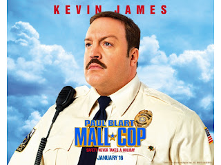
 Here we have a classic poster, the original Paul Blart Mall Cop.

Thursday, 28 January 2016

Movie poster analysis


 The Thing (1982) . This poster features a human-like figure standing in the middle of the poster with a bright light coming from its face. The mysterious figure is also fully covered in a winter outfit is in front of a light blue, white and black background which resembles snow and ice in the dark which is where a majority of the film takes place. The font in the poster is large, bold and the text connects to each other, just like 'the Thing' from the Thing. The tagline "The ultimate in alien terror" tells the audience that this film features an alien and it is scary, so the audience will know that this film is a sci-fi/horror film.

Master and Commander: The Far Side of the World. The first thing you will notice is Russell Crowe's face covering the top half of the poster. When this film came out Russell Crowe was a well known actor who had a good reputation for being in films. You can also notice that on the bottom of the screen there is no small text saying who the producers, actors, director, etc as Russell Crowe is the main selling point. You can also see that Russell Crowe is wearing an old sailing uniform and has a stern face, so that tells the audience that this film is set in the past and it is a serious film.. The bottom half of the image shows a boat at sea firing its cannons. That shows the audience that the boat plays a major part in the film and also that the boat will have to use its cannons, so it might attract an audience who is looking for an action movie. This poster uses a lot of the colour blue as the sea, sky and Russell Crowe's uniform is blue. The title of the film uses a font which is reminiscent of the past. The title of the film has a red line separating, "Master and Commander" and  "The Far Side of the World". That red line would attract your eyes to the title of the film.

Jack and Jill (2011). The first thing you notice on this poster is not one, but two Adam Sandler's making wacky and silly faces, so the audience know that this film is a comedy. Both of the Adam Sandler faces look as if they were taken as the Adam Sandler dressed as a woman is doing something wild which normal Adam Sandler is reacting to.  From this poster you can tell which one Jack and which one Jill is. The tagline for this film "His twin sister is coming for the holidays ... and it ain't pretty." tells the audience that this film could be seen as a Christmas film and it reinforces that this film is a comedy. The "...And it ain't pretty." also tells the audience that Adam Sandler will look stupid dressing as a woman, and that is the main selling point for this film. In the angled blue rectangle it tells us that "Adam Sandler is Jack and Jill", so people who recognise that actor who don't know his name, now know who he is, so that might attract more people to watch this masterpiece.

Wednesday, 20 January 2016

Stuff

In thin PNG, I masked an image of some fire onto a flaming car. I achieved this by selecting the fire layer and then double clicking on it. I then changed the blending mode from normal to screen.
In thins PNG, I blended a scratched metal texture over a picture of an 'Acklay' from the fan favorite film Star Wars Episode II Attack of the Clones.

Wednesday, 13 January 2016

Finished Castle

POW!

This time I  have added in a foreground, a background, more walls and levels ajustment.

The first thing I did was replace some of the walls in the foreground to cover up some cars that were there. I did this by using the marquee tool on part of the wall, I then copied that onto different parts of the wall.

I then added a foreground in. I did this by dragging the image of the foreground in. I then put it to the top of the layer list and used the paint bucket tool on it to make it hidden. I then used the paintbrush a drew what from that image i wanted in my final version.

Next I put the background in. I dragged the image into the bottom layer. I then placed the sun where I wanted it to be. I then had to use the marquee tool on sections of the image, then i dragged the marquee'd section out so it covered the background. I then did that again in a different area.

I then merged all the layers except for the foreground and the background. I did this so I could easily edit all the castle at once.

I then added dust into the image by selection the opacity type as "Linear dodge (add)" on a new layer located between the castle and the background.

Finally, I adjusted the colours by using the curves option to make the castle look darker as the sun was shining on the back of the castle.

K bye.

Wednesday, 6 January 2016

The great wall & tower

I have now put a wall into my castle. I done this by copying a brick wall and pasting it over and over many times to achieve this. I then used the polygonal lasso tool to copy a piece of wall support from the castle and pasted it onto the wall I created. I then cut the wall support up and pasted multiple parts of the main body back together to make it seem taller.

In this image I have used a photo of part of tower bridge and edited by copying segments of the tower and making them smaller as they get closer to the ground. I then cut an image of a bridge from a picture of a castle and pasted it in. I then made that bridge and tower a different colour by using the curves.
In this image i have added another tower into this castle. I copied the image of a tower from another image and put it in my image. I then cut the image down the middle and pasted it back in and flipped it horizontally.